‘Content is the king’; search this quote and you will be served with millions of results. But after researching millions of websites it is revealed that this statement is followed in just a few website designs. In this post of mine I am going to put a limelight on the importance of the fonts and typeface in a website design. Icing the cake; I will also tell you the ways by which you can make your content look more attractive via the proper use of fonts and typeface.
Writing an engaging content is one aspect and attracting the visitors to read it is another. The typeface and fonts are the main attributes of the content which magnetize the readers to look at. It is a fact that nobody loves to read dozens of boring paragraphs on a webpage. But an efficiently and properly presented text can surely bind the attention of the visitor to the interesting content.
During the process of website designing; there is no. of factors which must be considered to make your content looks more appealing via the typeface used. Some of these points are:
- => Forms of the letter
- => Proper spacing is a must
- => Don’t ignore the punctuation marks
- => Never forget about readability
Forms of the Letter

Text is a part of website design and if the text is not complementing with the theme of the web page; it will look DUMB. While compiling the text on the webpage, it is very imperative to look at the forms of the letter so that it looks like a part of the page rather than being a pushed element.
Proper Spacing is a Must
Needless to say; ‘pr opers paci ng‘ is always a vital aspect to look at. Beside with providing an unprofessional look; improperly spaced content actually ask the readers to try something else.
Don’t ignore The Punctuation Marks
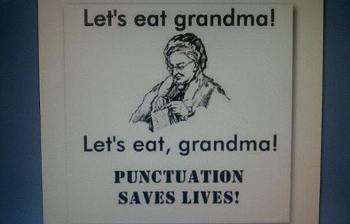
Punctuation marks are a minute part of content but they hold the significance to change the complete sense of a sentence. So if you don’t want you different readers to interpret different messages from your text then just don’t dare to ignore the punctuation marks.
Never Forget About Readability

You can never expect your readers to read about your services (even if it is the best) if it is very hard to read. I had come through a lot of websites in which the font of the content is too bold or too short to force me to say ‘someone please tell me! What’s written there?’
Conclusion
If you want to grow your business via your website than it becomes very important that you showcase your services impressively. I hope that the above tips about the proper content design will help you to create a much more user friendly interface. A properly presented content will surely boost the possibility of turning a potential user into a happy client.