The days have gone back when we had to switch on different devices for similar tasks. Say, for example, VCR cassette is only compatible with the VCR player not on to CD player or computer disc tray. To overcome such hitches, Ethan Marcotte appeared with the concept of Responsive Web Design. This is an approach that leads to web pages creation which uses flexible images, flexible layouts, and cascading style sheet media queries. With this technology, web pages can be built and can be detected to the visitor’s screen size and orientation and change the layout accordingly.
Responsive web design has defined a technique that helps your design in scaling with the ever-growing array of devices and browsers.
The Responsive Web design uses the three core technical concepts, i.e.
Media queries & media query listener
Flexible media & images via CSS or dynamic resizing
Grid-based flexible layout for relative sizing
By implementing this technical approach, the designers can be on the road to a responsive website.
The usability and benefits of Responsive Web Design:
Solving Proliferation: Responsive web design is considered the best way to sort out varied designing problems created by the proliferation of new mobile devices.
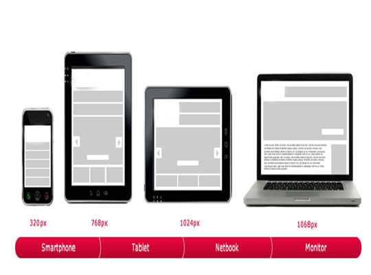
Multiple Sizes Compatibility: The responsive web design has made it possible to enjoy the same surfing experience for handheld as well as desktop devices. Being compatible to varied screen sizes, you can view your desired content on laptops, tablets, Smartphones, and televisions that are enabled with the internet. It has become possible with CSS3 that expanded media queries capabilities. In this way, it lets style sheets to come up with a device’s display serving different devices based on the query response. Responsive Web Design fits with the idea of making users’ devices useful with flexible layouts.
Grid Pattern: It is defined as adjustability as this process allows content redistribution in a fluid manner at the time of switching between horizontal and vertical views. The fluid website design can be contracted, expanded, removed or rearranged based upon the user’s screen sizes. It gives the advantage to end-users, where they can interact with their favorite sites regardless of devices (or when away from home).
Responsive Web Design Testing Tool: This responsive web design tool has been specifically designed to test the responsive websites at the time of designing and building them. This tool has been built to help with testing your responsive websites while you design and build them. It is very easy to carry out the testing process just by entering URL into the address bar and test the specific page. You can also hire a Dedicated Web Developer to get the best results.
Though, responsive web design is something that has such a wide area that it would be quite difficult to discuss all the points in one post. But, the focus of responsive website design is to make websites accessible to mobile users which are expected to be accountable for 10% of the internet requests. The best example of this surge can be stated in the availability of best responsive WordPress themes. Thus, Responsive Web Design is the best answer for your tablets and Smartphone that come in varied resolutions and screen sizes. This technology makes it possible for users to view content on these devices irrespective of their sizes and resolutions.
Posted By: CSSChopper Team.