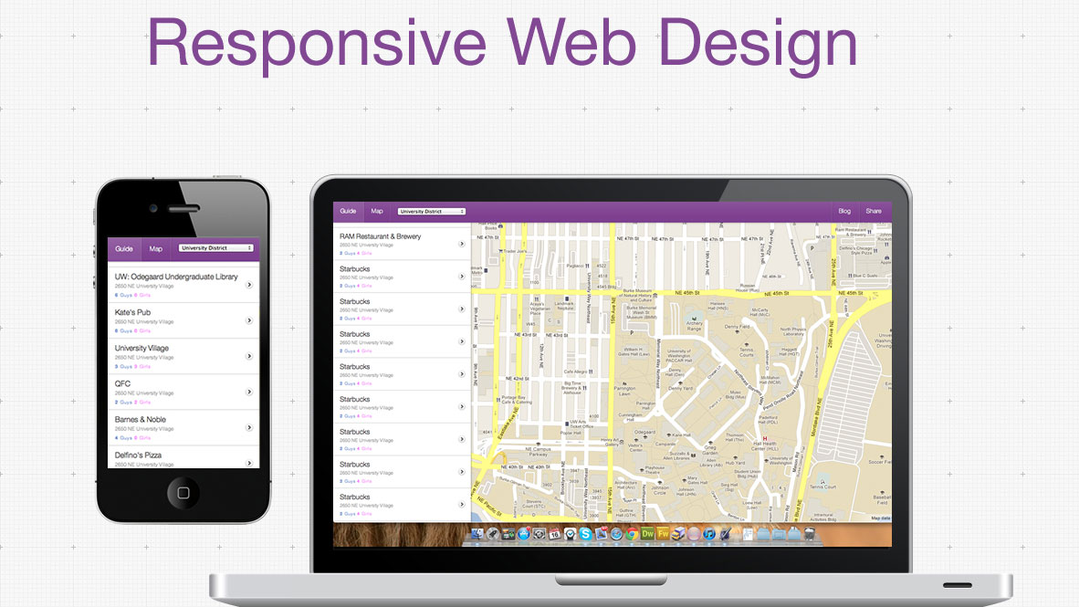
We are living in the world of growth, inventions and discoveries. One of the popular inventions is PC as it revolutionized the world after becoming a common home appliance in 1990. How can we forget that new inventions always come with needs and needs pose problems? Advent of internet gave birth to multiple devices like mobiles, netbook, tablets, smart phones and much more. Now, we are met with the issue that users visit varied sites with different devices and get stuck as all sites, their contents, images, etc cannot be viewed on every device. To get away with this sizing problem, Responsive Web Design (RWD) is being recited all over the world.
Evolution of web designing industry with RWD Concept: In the absence of the name of Ethan Marcotte, CSS techniques and design principles even cannot be imagined as he appeared with the first article stressing on the importance of these techniques. Using Cascading Style Sheets 3 media queries (CSS3) including fluid grids, flexible images, it would be easier to browse and read content on diverse devices and browsers with using panning, resizing and scrolling at minimal level. Web designing industry is persistently growing with amazing and larger photographic backgrounds and bigger header images, in order to attain compatibility multiple technologies such as HTML5, jQuery and CSS3 are used.
Thus, a responsive site is created with three robust features of CSS3:
? Finely used flexible/fluid grid
? Get well with responsive images
? And last but not least Media queries
With a perfect blend of these three features, whenever a user switches from laptop to mobile phone, the website will be automatically be switching to get in accordance with resolution, image size as well as scripting.
The scope of responsive web design is really wide as technology is seeing some kind of developments every single day. Several tools are responsible and play a vital role in the procedure of making design of a website responsible. These tools are used in different phases:
Role of Adobe Device Central CS5.5: The production task of interesting and interactive content of tablets, mobile phoned and other related devices can be simplified. Responsive web developer ensures that images and well as content provide an engaging experience to users.
Adopting FitText Process: Taking assistance of JQuery plugin for web type that contains fluid or responsive layout, a web developer make sure to attain scalable headlines which can be used to fill the width of a basic element. With the help of too, font size is made flexible and adaptable with varied screen sizes.
Usage of Grid System: In order to make a responsive web design grid system plays a vital role as it provides robust visual and structural balance to websites. Using the latest layout structures, it allows visitors to experience amazing flexibility and visual appeal in a website.
Trend of Gridless Option: This is an open source that goes well with all the modern browsers as well famous for offering smooth and hassle-free responsive website design. Used in a perfect amalgamation with HTML5 and CSS3, it lets users relish with the facility of cross-browser compatibility, appealing typography and on the top of its responsive website.
Skelton: Popular as a popular boilerplate in responsive web design, it helps in creating mobile-friendly development and wonderfully looking website design whether it is a screen of laptop, mobile and iPhone. This process is a useful collection of CSS and JS files.
Core Features of Skelton Process Includes:
? Grid down to mobile
? Fast to start
? Style agnostic
Advantages of Responsive Web Design:
Viewable on Different Devices: Amazing things RWD is that it facilitates users to view content on all Smart phones (Blackberry, Nokia, iPhone, etc) as well as tablets.
Optimization of Layout: As it enables users to attain changing content on their respective website into optimized on all devices then they are able earn more potential traffic for their website.
Future of Responsive Web Design:
RWD has appeared with those benefits and features that demand for those is never ending. And, if the demand of its features and their usage is so much then its future can be viewed with lots of developments and advancements in all sectors of lives. Survey and statistics done of responsive website have shown that 80 % users will be working with Smart phones and tablets by the year 2015. Thus, using a website without its compatibility with diverse features means the loss of huge amount of money in businesses.
Posted By: CSSChopper Team- Hire Responsive Web Developer from #1 PSD to Responsive Web Design Service Provider.


