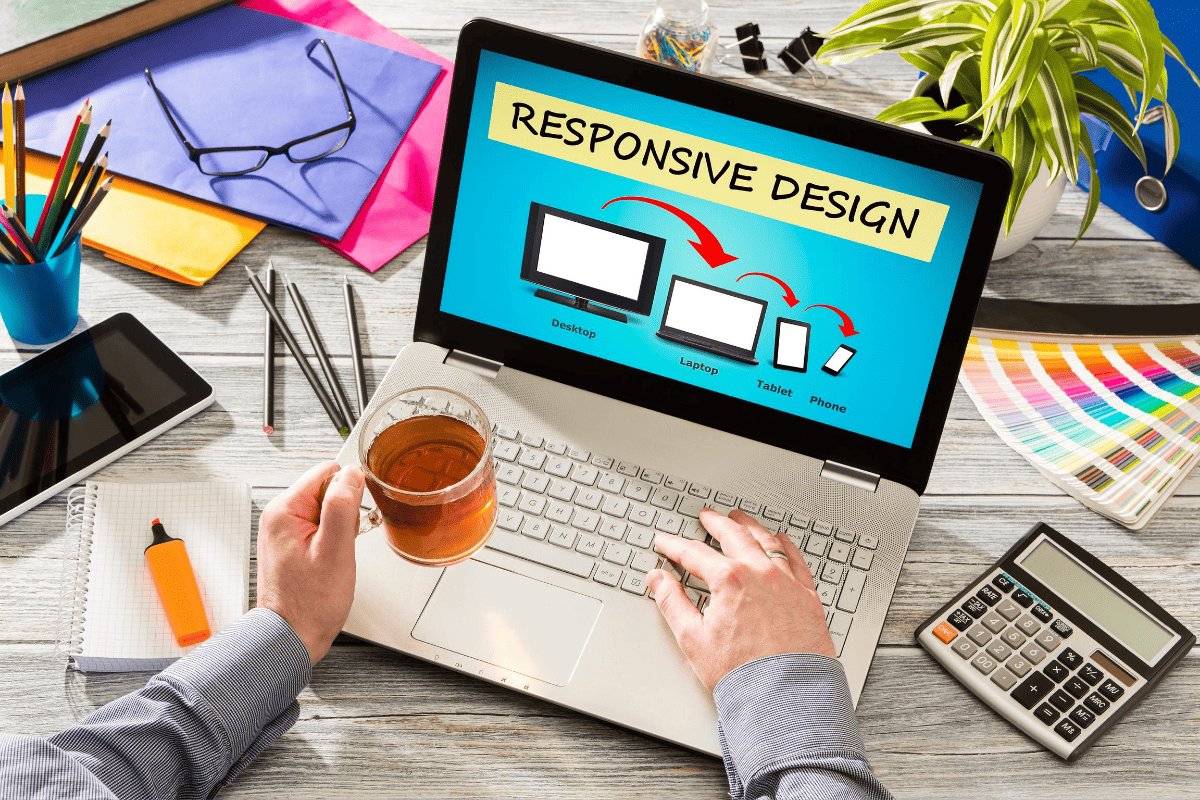
The wind of advancement has affected the scenario of single desktop screen with the expansion of mobile websites at each nook and corner of the web. Site owners need to have a keen eye on how their work is showcased across various devices. Responsive web design is the ultimate solution to safeguard them from the chances of losing visitors from one device so as to gain visitors from another. RWD offers a perfect compatibility as correspondent to each screen size and devices like for mobile, tablet, iPhone and iPad, along with laptops and desktops.
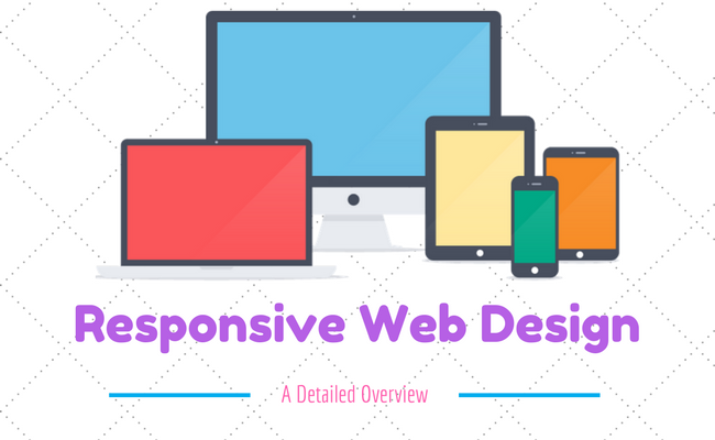
What is Responsive Web Design
The principles of responsive web design can be understood from a saying that defines “content is like water”. It means that it can take the shape of the device in which it is placed.
Responsive web design is a worthful approach which demands that the design and development of a website must respond to the user’s behavior and environment, as per the platform, screen size and orientation. It employs a fair combination of images, adjustable grids and layouts and a smart use of CSS media queries.
Why is Responsive Design So Important?
Responsive web design concept is not merely about adjusting screen resolutions and automatic resizable images, but it is a very broad approach about thinking for a design differently. In the recent times, the ultimate solution is to create such design that can work and must respond to the multiple browser versions. You have open doors for testing your website on various devices.
Some Important Credentials of RWD:
- Know Your Audience: RWD is the answer to most of the businesses which helps them in knowing their audiences and the device that they are using.
- A Prompt UX: User experience is the key to RWD and it goes much beyond translating a desktop site into mobile screen. Here, the points to be taken into consideration are user experience, necessary content they are looking for and their interaction.
- Focus on Content: To design the site as per the content is a good habit to follow during responsive designing instead of a specific screen dimension.
- Limited Space Consumption: The mobile view is much more focused as compared to the desktop with limited amount space usage.
- Easy Navigation: The design needs to be flexible enough for a relaxing UX and the complex designs must need to adapt to the simple intuitive UI for small mobile screens.
What Website Dimensions Should be Used ?
We cannot specify a standard website size as there are hundreds of devices available along with plentiful screen resolutions out there. Each user works on the different device as per the usage, like an individual may explore something on your mobile while on the way or may even use the laptop while working on some task in office. So, the best approach here is to design multiple versions as per the different browsers’ widths.
If you want to check whether your website is responsive or not, you can use a responsive design testing tool.
Mobilegeddon: Google’s New Update for Mobile-friendly Sites
Responsive web design is an important aspect for the mobile traffic. For this, Google announced an important update Mobilegeddon on 21 April 2015. Each business of varying size will catch Google’s attention if their site follows friendliness with the mobile devices. This approach is followed by keeping in mind the fact that the mobile device users are increasing at a rapid rate and to keep them in reach, it is crucial to have mobile friendly web pages for offering a sound user experience.
Elements of RWD
An RWD site adapts the layout to the viewing environment via using fluid, flexible images, proportion-based grids, and CSS3 media queries (an extension of the @media rule) in the following ways:
- The Fluid Grid concept allows page element sizing in relative units such as percentages, instead of absolute units i.e pixels or points.
- Flexible images also follow sizing in relative units so that they can be prevented from showcasing outside the containing element.
- Media queries enables a page to use different CSS style rules in accordance with the features of the device on which a website is being displayed, like the width of the browser.
Fluid Grids
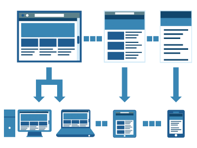
They follow percentage values instead of set pixels while designing a website. After following this concept, the elements in the mobile screen layout will be resized in relation to each other. It tends to render content in the same order as it appears in the DOM, and it prompts reflow of content during its resizing. Fluid layouts also count for relative resizing of both content and containers which allows the text and content to be enlarged and shift other content automatically at the bottom of the page.
Media Queries

It is the code which has been implemented to a website while it is being made, to set the conditions in a design that will adapt to the screen size. Media queries are used to provide different CSS as per the device properties.
Like for say, specifically for iPad, there is a unique media query property known as orientation. The values vary for landscape and portrait.
@media screen and (orientation: landscape) {
.iPadLandscape {
width: 30%;
float: right;
}
}
@media screen and (orientation: portrait) {
.iPadPortrait {
clear: both;
}
}
Google’s Resizer

It is a useful approach to preview your website with ease on multiple devices. Resizer is made to simply test the viewability of a website. It can be understood as a tool to check the responsiveness of the website by changing the dimensions of a web page. Being a browser-based tool, you have with you a series of predefined icons, once it has been activated.
Flexible Images
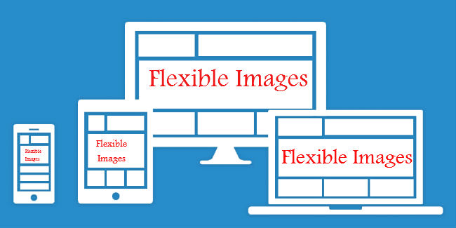
Images with utmost flexibility are really important for designing a responsive website.
There are several points to consider including image scaling, how will it appear on different devices including large desktop, tablet and a small mobile screen. The code Images are allowed to scale with the code through a percentage value to the width of the browser window.
Image resizing can be efficiently incorporated with the code below-
<meta name=”viewport” content=”width=device-width; initial-scale=1.0″>
Conclusion
Being responsive is a beneficial approach to add beauty to your website and uplift the sales in turn. A tech-savvy can better understand how indispensable it is to follow responsive behaviour in your web design. To deliver an alluring experience to the site users which is also a rewarding aspect in the Google rule book is like getting the dual benefit. You are in SERPs and rich traffic is knocking your door.
Categories
Recent Posts
Popular Posts
- How to Choose a Reliable Offshore Development Partner?
- Transforming Web Development with HTMX’s Declarative Approach for Dynamic UIs
- Top 15 Ecommerce Growth Strategies to Maximize Sales in 2026
- What is B2B Web Design? Benefits, Best Practices, and Examples
- Why Your Conversion Funnel Needs a Composable Commerce Solution?

