The demand of portable devices such as SmartPhone & tablets is growing day-by-day with the development of new technologies. In fact, people are using different applications to perform multiple tasks easily on their electronic devices. To survive in the market many online businesses, corporate site, search engines and social networking site are transforming their site to be full of interaction for these devices. For this there is a birth of two techniques that is Responsive and Adaptive web design to enhance the interaction for users.

Adaptive and Responsive designs both are evolved basically to beautify the site at the electronic devices. But they differ in the strategies. Lets know learn about them one by one then you can identify the web design easily.
Overview of Adaptive and Responsive Web Design
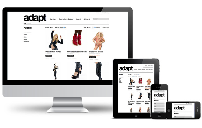
In Adaptive design the dimension of the theme is already defined or preloaded at the server so that when the site run on the system it takes the space according to the width of the system screen the system can be anything whether it is Smartphone, Tablet or desktop. The automatic modification of the screen is seen through the content layout, presentation graphics and client side scripting layer.

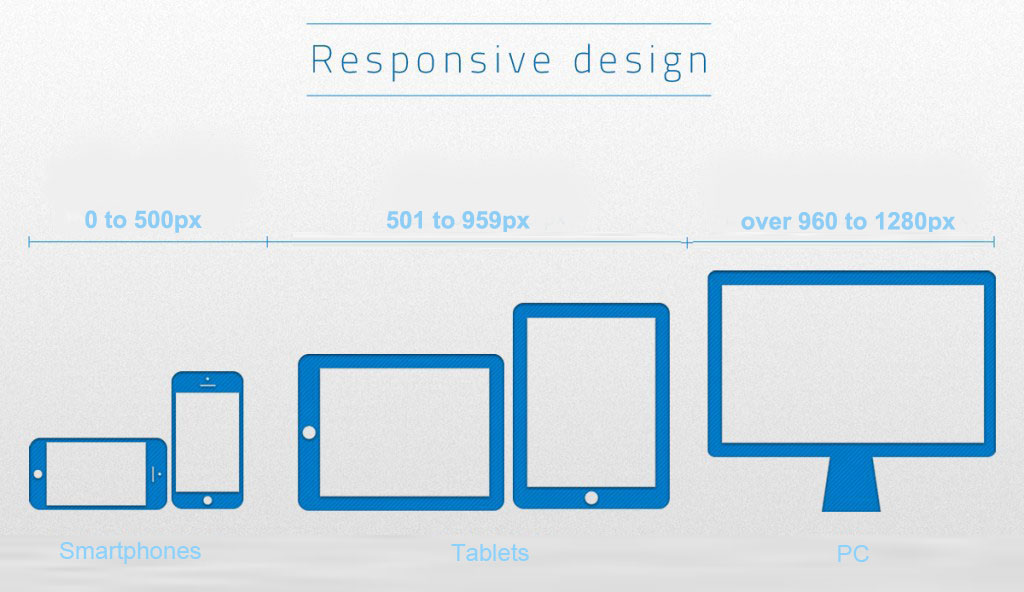
Now comes to Responsive Design, the Responsive design uses the idea of fluid layout. As we know that the fluid has the behavior of changing itself according to the device dimension the same is applied for the web page, when web page is executed at different screen the ratio of the content viewed on the screen get adjusted according to the dimension of the screen.

Understand the Technical differences between the Design
As it is cleared to you that the both the techniques are implemented to give the dynamic structure to the site but follow different strategies. First one that is Adaptive design there are various coding defined at the server side for the platforms such as different types of Smartphone or Tablets. If you see the adoptive design you will observe lot of changes in the content layout, presentation layout and screen layout too.
On the other hand if you see the responsive layout design, you will observe the content layout will be the same only the change in the ratio of size will be observed. You can also witness blurring in the images too. One will make use of the media queries to target that the website should appropriately look at specific devices or screen sizes. Now comes to backend truth that is responsive layout design needs lots of coding. Responsive design takes more time while loading at screen.
Conclusion
Hope that you understand the basic difference between the design layouts. Here this blog is conveying that which design is better. Both designs can be used for different condition. If you are developing a web application for particular devices then in that situation it will good if Adaptive design is used but when you are not aware about device then you can think for responsive web design.
Categories
Recent Posts
Popular Posts
- How to Choose a Reliable Offshore Development Partner?
- Transforming Web Development with HTMX’s Declarative Approach for Dynamic UIs
- Top 15 Ecommerce Growth Strategies to Maximize Sales in 2026
- What is B2B Web Design? Benefits, Best Practices, and Examples
- Why Your Conversion Funnel Needs a Composable Commerce Solution?


