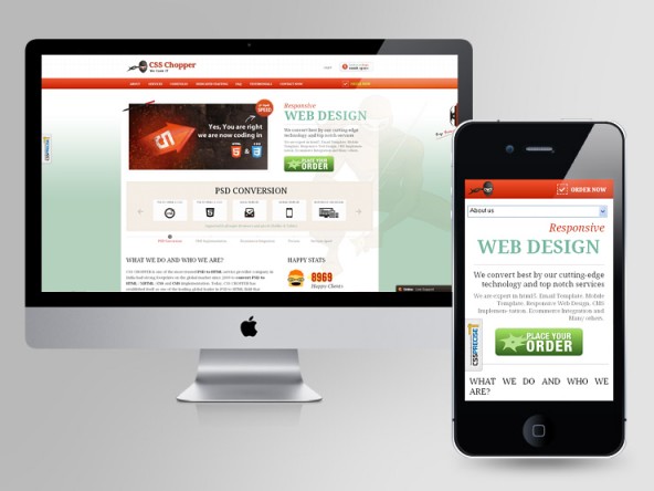
Responsive web design (RWD) is the technology of the year 2013, which is providing convenience and intuitiveness to the internet surfing experience, regardless of the browser’s multiple resolution sizes.

For many novices, it would be obvious to ask, “what the heck is RWD”? Go through the blog, which is posted exclusively to guide the beginners regarding ‘Responsive web design concept’.
LEVEL I
Responsive… Responsive… Responsive… What exactly is it?
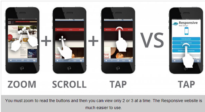
Today, RWD technology runs behind multitudes of websites, in order to provide Multiple Fluid Grid Layouts that work flawlessly on any resolution size. Earlier the web applications (having Multiple Fixed Width Layouts) were developed focusing only on a particular set of device (say for example desktop/ PC, tablet, mobile etc.). Therefore, a single business’s website needs to be developed for multiple separate devices such as for mobile users, tablet users and laptop users. This is where the need for Responsive Web Design emerged and acclaimed globally for bringing the theory of “one-for-all” website concept.
From where the problem arose
With the increasingly launching multiple devices, browsers and platforms, there was a need of one technology that can act like a ‘Panacea’ for all. RWD is the one PERFECT solution, replacing the need for having multiple sites with the one purpose.
The RWD based website can work efficiently for PC’s browsers as well as other multiple handheld devices available in the market. The technology uses mixed approach i.e.,
- Fixed width for large to medium devices
- Fluid width for small sized devices

LEVEL II
Time to upgrade your knowledge about RWD
Expanding your knowledge about something in-depth, without mentioning about the inventor is truly unfair. Ethan Marcotte, the creator behind the RWD technology, who states RWD as the set of techniques and notions that makes it a complete thing!
What problems can RWD resolve?
Today, computers aren’t a piece of hardware devices but people spend their quality time there, whether it is a source of entertainment or income. With the constantly upgrading web technologies, the tech-savvy users and audiences expect for enhanced browsing experience, especially on the handheld devices (which they easily carry all the time). RWD is helpful in resolving the problem to meet the broad spectrum of devices’ resolutions and screen sizes with just one version of the application. Also, we can say RWD is future friendly, as it perfectly fits the need of a vast range of devices lunching today or in-future.
LEVEL III
Getting familiar with technical terms like Fluid Grids & Media Queries
Remember, I mentioned Fluid Grids in the preceding section (level 1). Fluid Grid is very essential in RWD, as it plays an important role in giving its core essence. Whether the layout is widened to the big desktop screen or squeezed onto the tiny mobile screen, all the elements in the layout should work proportionally to each other, in order to render high fidelity screen resolution to the viewer.
Secondly, Media Queries are also a crucial aspect of RWD that lets you accumulate the data from the visitors’ end and accordingly apply CSS Style. Media Queries are said to be the hub of any RWD framework. In short, a media query is used for declaring the parameters of CSS based on the dimensions of the currently used device. Two methods are followed for calling a media query
- Writing straightly in a stylesheet
- Employing an external stylesheet
Why to adopt the trend of Responsive web design
Search engine friendly: The websites developed using RWD are favored by search engines because of their friendly structures that are easily read by the crawlers. Multiple sites for just one common purpose are accidently considered duplicate content by the search engines. Such type of websites may deteriorate the ranking in the search results.
Adaptive layout: This is the best thing about RWD, which adapts quickly to the device screen and resolution. The website on a desktop will give complete information about the site including the big menu bar for easy readability. On mobile screen, the web application will shrink the large menu bar with a dropdown menu, without missing the essential information from the web application.

Enhanced accessibility
The websites developed using responsive web design technology offer enhanced usability for the users who have motor, visual and similar impairments. This makes your website accessible by a larger group of people and hence spreading your website’s popularity and resulting in increased traffic.
On a short & crisp note, responsive web design technology gives ease to the online audiences (to enjoy the site seamless without manipulation hassles) as well as giving site patrons (to earn good returns on investments). The online users can experience app-like browsing experience for faster loading and intuitive working pleasure. However, hiring
Hope after reading this blog, the novice Responsive web page designers would have gained sufficient knowledge about Responsive Web Design in a simpler and interactive way.
Posted By: CSSChopper Team
Categories
Recent Posts
Popular Posts
- How to Choose a Reliable Offshore Development Partner?
- Transforming Web Development with HTMX’s Declarative Approach for Dynamic UIs
- Top 15 Ecommerce Growth Strategies to Maximize Sales in 2026
- What is B2B Web Design? Benefits, Best Practices, and Examples
- Why Your Conversion Funnel Needs a Composable Commerce Solution?


